Scroll down to view summary
ARÓN JACO x VANS - CONCEPT
CLIENT / BRAND:
SEASON:
VANS - SKATE
S/S 25
Creative Direction
Color & Material Design
Footwear Design
PROJECT TYPE:
Design a performance skate shoe that expands Vans’ cultural narrative by celebrating under represented subculture and the growing movement of rebellion through identity and self expression through skateboarding. This project aims to challenge the commercial norm within skate culture while honoring rebellion, heritage, and community.
PROJECT GOAL:
My responsibilities in this project were conducting market and cultural research and identifying ways VANS could expand its cultural footprint through authentic storytelling. I was responsible for the footwear design, sketching, color and material design, creating color stories and mood boards, and developing a visual narrative that merged performance skate culture with indigenous identity and heritage.
MY ROLE:
This project began with a question: What does rebellion look like when it’s rooted in pride - not rejection?
For this conceptual collaboration with Vans, I turned to Bolivia’s growing cholita subculture - a bold movement redefining what it means to be indigenous, feminine, and powerful.
“Cholita” was once used a derogatory term to belittle indigenous women but has since been reclaimed as a symbol of resilience, identity, and fearless self-expression within a growing subculture of Bolivia’s youth . By turning our lens toward Bolivia’s cholita subculture, this project aims to highlight a community of woman who personify resistance with grace. I chose to focus on the cholita culture for this project to challenge the commercial norm and narrative within skate culture and amplify the voices of subcultures often left underrepresented. At the core of this project is a mission shared by both myself, ARÓN JACO, and Vans - to celebrate individuality, rebellion, and identity.

Maria - La Cholita

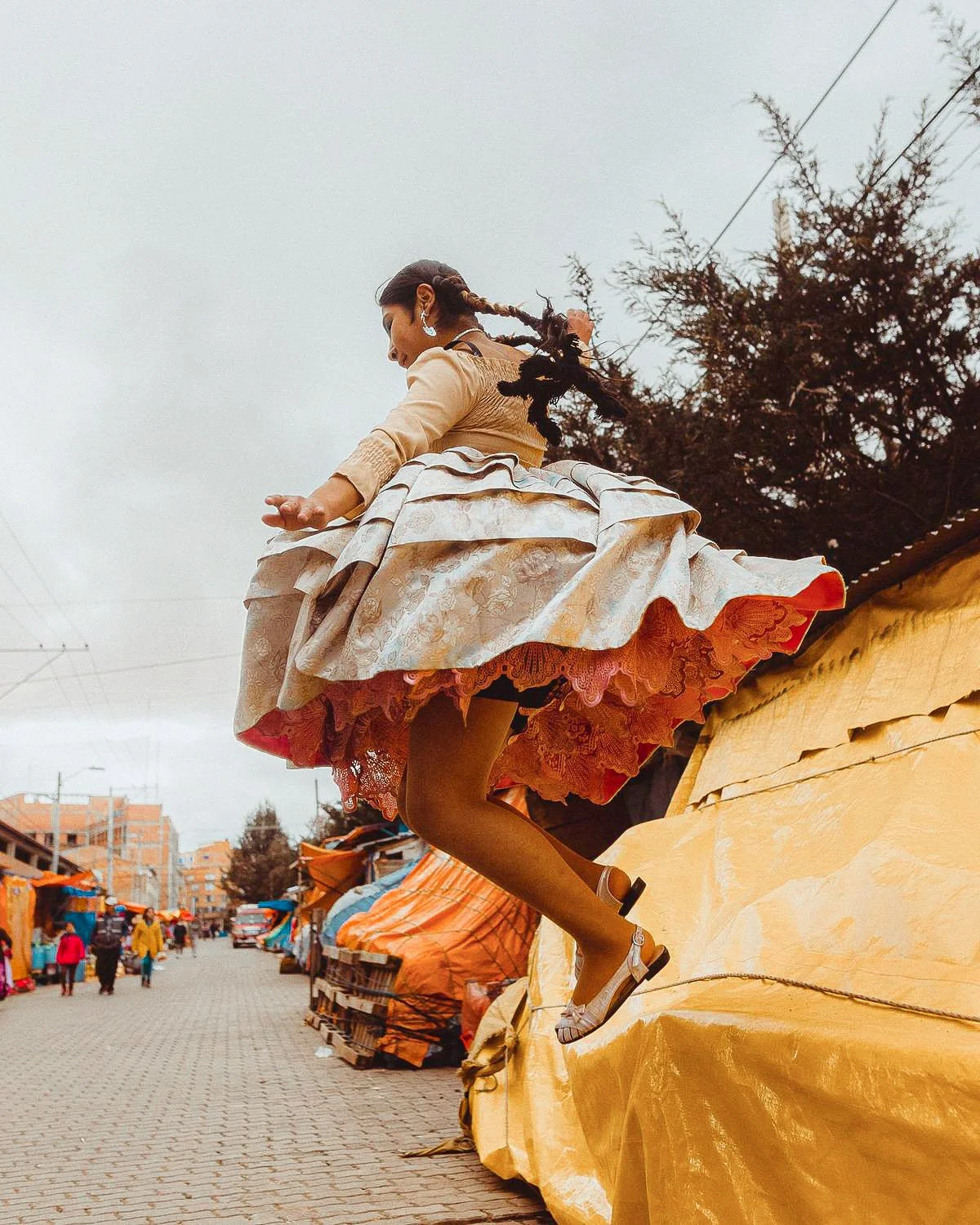
The cholitas are more than a subculture - they are a movement. With their traditional skirts (polleras), braided hair, and bowler hats, they have reclaimed their identity on their own terms. Whether through skateboarding, wrestling, or mountaineering, these women are redefining femininity and power in spaces that once excluded them.
The intended customer for this project is someone who feels like an outlier but refuses to be invisible. They are bold in how they express themselves and are proud of where they come from. Like the cholitas, they carry their ancestral history with pride and use creativity to make space for themselves and others.
This shoe was designed for the ones who skate with purpose, speak through style, and see identity as something to be celebrated - not compromised. It’s not just about performance, it’s about rebellion and representation.
-
Pollera skirts carry a lot of historical significance. Introduced during Spanish colonialism, these skirts were once symbols of subjugation but now young women wear them as symbols of pride and resistance. The act of skating in polleras is more than visual impact, it’s a form of resistance that says “we won’t trade our identity for access”
-
collectives of cholita skaters use skating not just as sport, but as a cultural platform to teach youth and expand access to skateboarding for young girls in both the U.S. and Latin America
PRODUCT RESEARCH & INSPIRATION




IDEATION SKETCHES


DESIGN SOLUTIONS

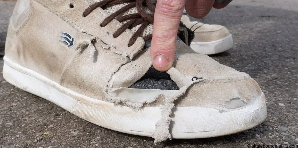
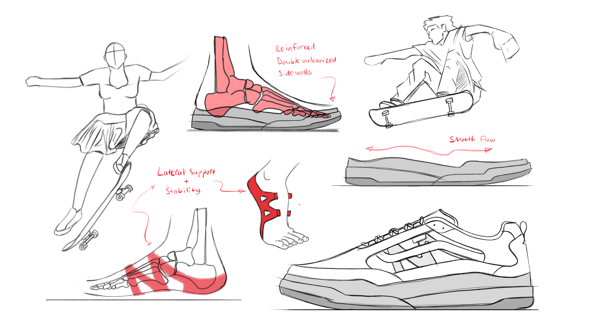
While sketching this product, I made sure to keep functionality and durability at the forefront of my design considerations After working through numerous ideations of durable outsole tread patterns, textile and material upper combinations, and thinking through support systems that provide both stability and comfort while skating, I came to a few conclusions made through both observation and user insights.
-
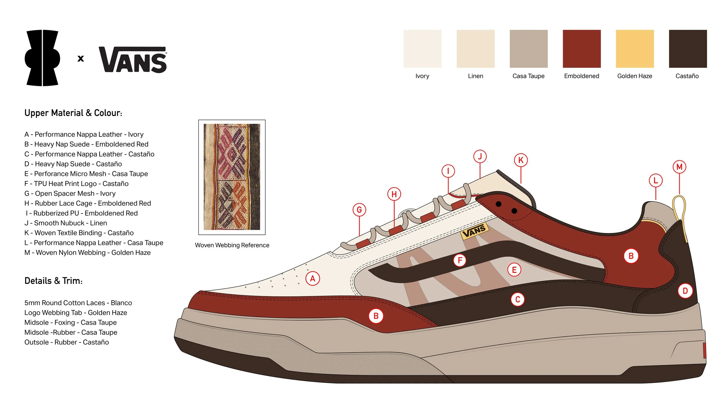
A lot of tricks require the foot to exert a lof of speed and force in a lateral direction and this puts the foot in a vulnerable positions. To protect the foot during this motion, I designed a TPU “cage” thay wraps around the midfoot creating a secondary layer of protection and provides stability across the midfoot when performing lateral movements and tricks.
-
The upper is reinforced using VANS’s duracap technology and has been carefully designed with abrasion and wear in mind.
The laces are protected using a hidden gillie system reinforced with tpu that protects the laces from ripping due to constant friction with the board.
The toe features asymmetrical details covering more of the “at risk” areas, and the mudgaurd covers more of the “flick zone” along the lateral side of the quarter and vamp.
The design of the rubber foxing acts as an “ollie gaurd” as it comes up to protect more of the foot in key areas.
-
The outsole is made up of 3 main parts featuring the outsole tread rubber bottom, the cupsole unit, and a layer of foxing that provides an additional layer of protection along the sidewalls. This construction provides great durability and comfort without compromising board control for the wearer.
COLOR STORIES
Raíz Saturada
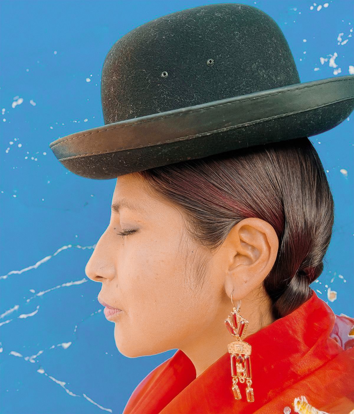
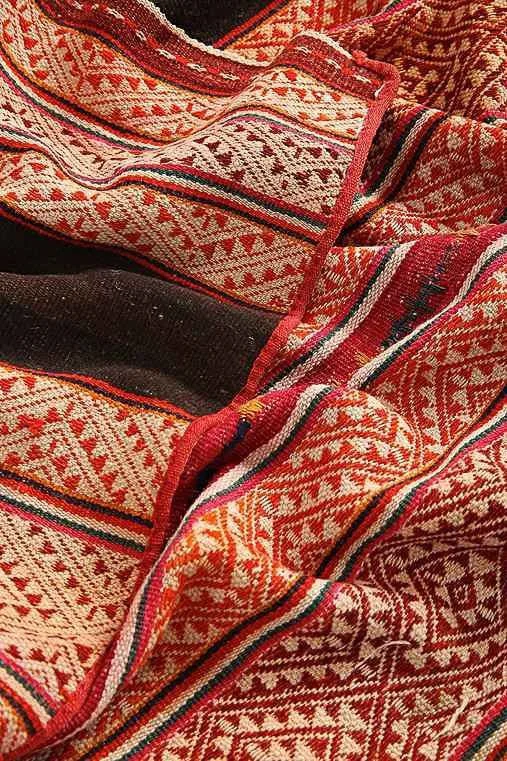

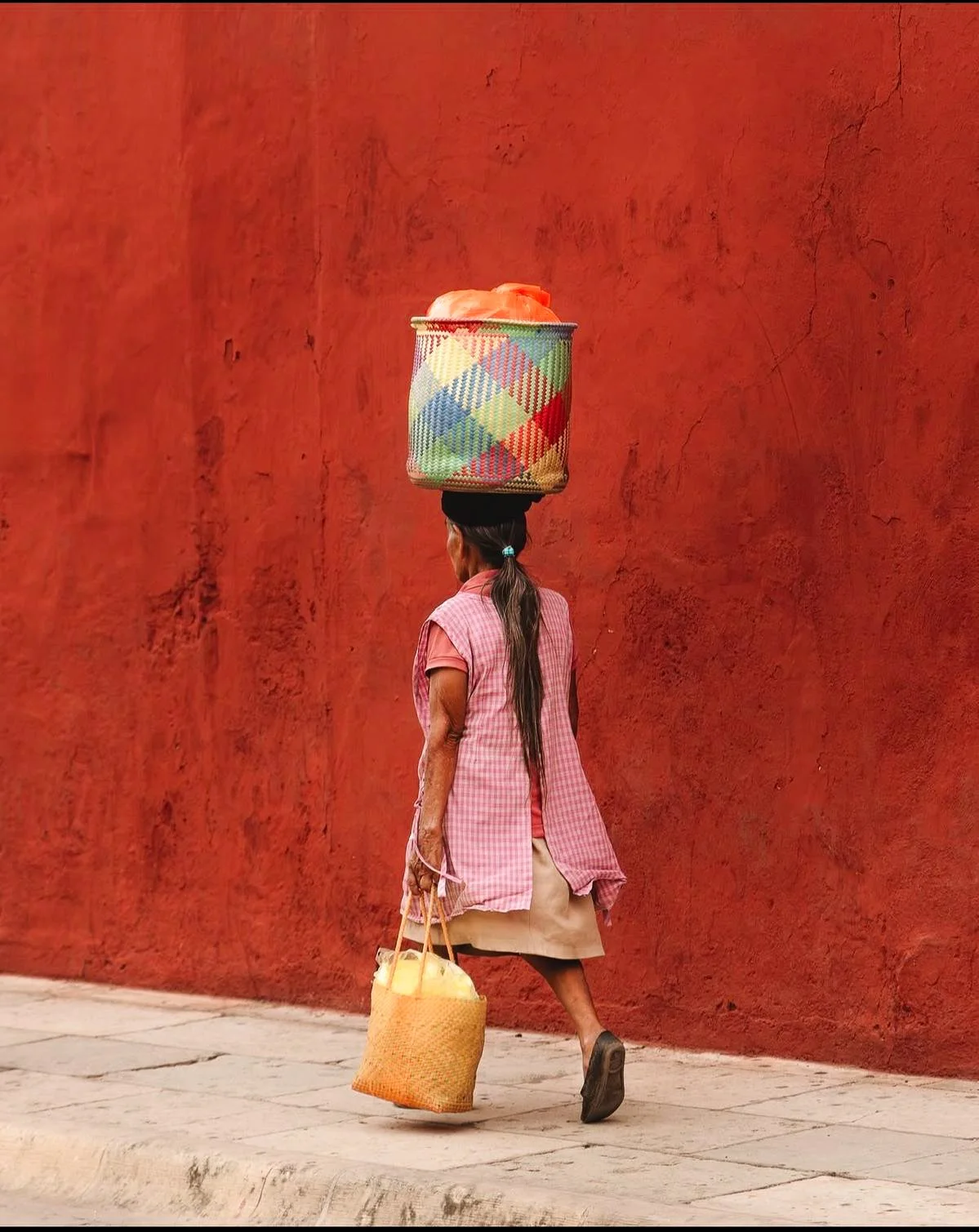
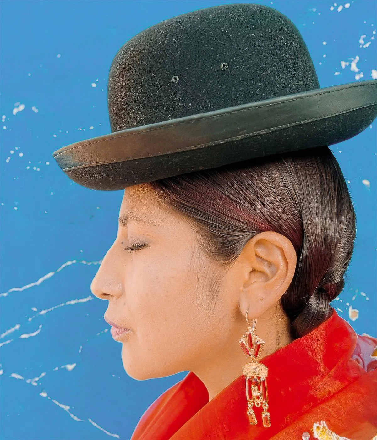
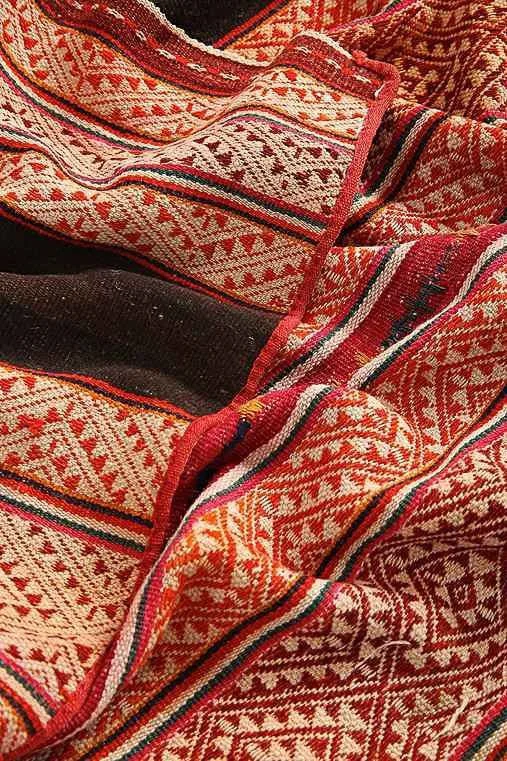
From the intricate details of bolivian textiles to the vibrant colors of the pollera, the aesthetic of cholita culture is rich with symbolism. This bold red and blue palette draws from the vibrancy of traditional Bolivian dress and urban backdrops, where saturated hues symbolize strength, pride, and celebration. Red evokes passion and the combination of blue offers a contrast and symbolizes the spirit of bold self-expression. These colors are also staples in many performance products and therefore create a natural bridge between cultural heritage and modern athleticism. This color palette tells a story of movement rooted in tradition.





Herencia Suave

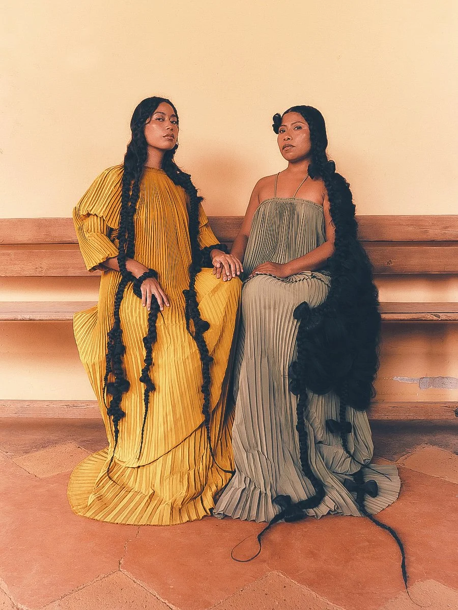

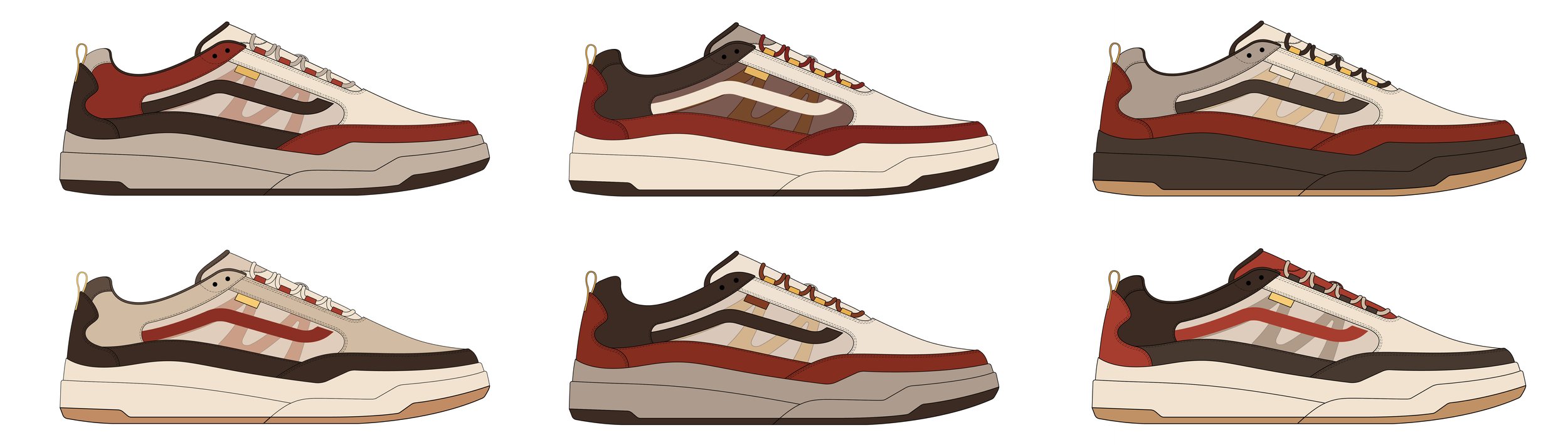
This color palette draws inspiration from a quieter kind of strength that is rooted in softness, grace, and natural beauty. Inspired by the quiet confidence of cholita women, these hues reflect muted tones, marigold yellows, and warmer neutrals that are often seen in traditional garments and home interiors. The editorial tone of this imagery reimagines femininity not as fragile, but as grounded, radiant, and unapologetically real.